Introduction
Tesoro is among the best-ranking jewelers in Pakistan. For this project, i’ve worked with a team of 2 designers on the front end of their e-commerce store.
Client Requirements / Goals.
The client already had the backend APIs ready and wanted to build the Front end app as a Single Page Application. Below is a list of things the client asked me to do.
Develop the front end as a Single Page Application in Vue.
Write modular CSS so that every CSS component is independent, consistent, and reusable,
Write CSS so that it’s not tied to Vue components and can be used independently with plain HTML.
Make the website Fast and Lightweight, it shouldn't take time for customers to load the website.
How I Build It.
Pretty much started from a new Vue installation and just started building components one by one from the designs I received from designers. Since it was an e-commerce store there were a lot of dynamic components such as filters autocomplete, product images, sizes, etc I built all of that from scratch.
I used SCSS instead of CSS 3 for styling since it is much easier in SCSS to structure folders and write modular reusable styles.
For making the website Fast and Lightweight I didn't use any CSS framework and coded all the styling from scratch.
CSS class naming is hard and my biggest challenge with the project was trying to not tie down the styling to specific pages but instead write most of the components as global, reusable components, that are independent of each other, and can be used anywhere without the need of modification.
What I Learned.
This was a big project for me at the time. I learned a lot about writing reusable code, organizing codebase to scale, and developing custom layouts. After this, my CSS skills improved greatly.
I completed this project in the early days of my career, at the time I was around 2 years into web development, and I think I still did a solid job.
Below is a list of some of the pages from Tesoro.pk
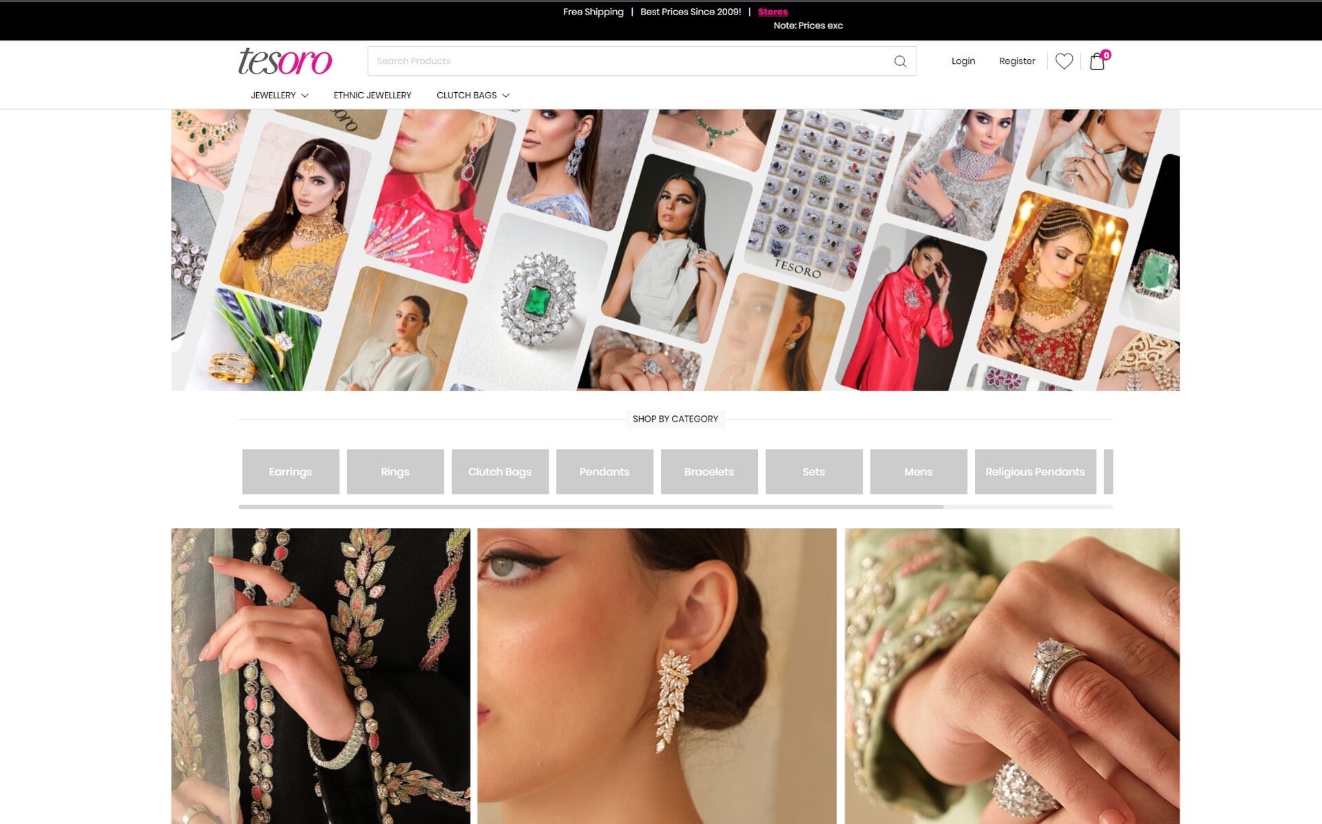
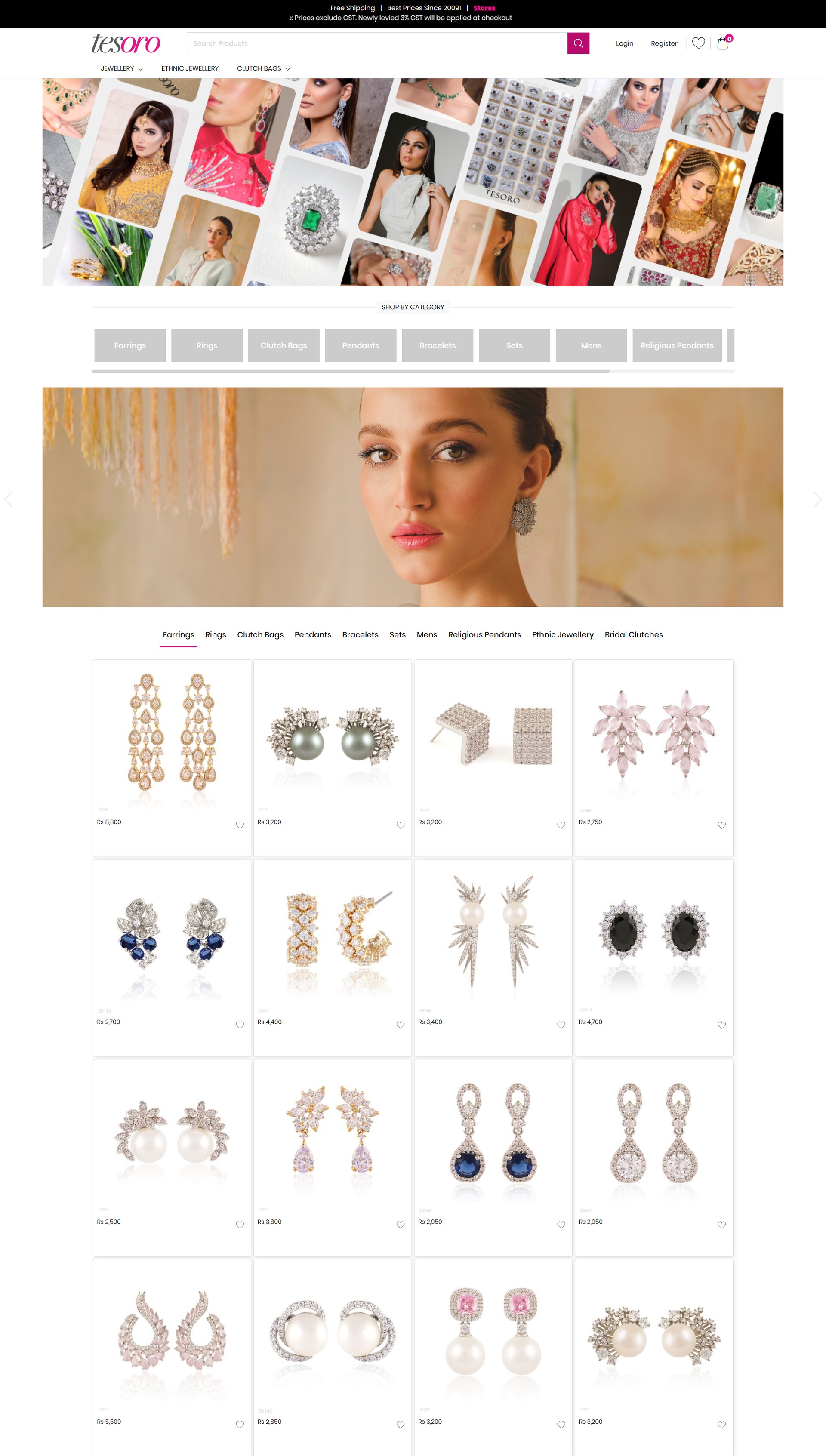
Home Page
The home page consists of a hero section then there are categories in horizontal tabs kind of thing, and then there is an infinite scroll of products.
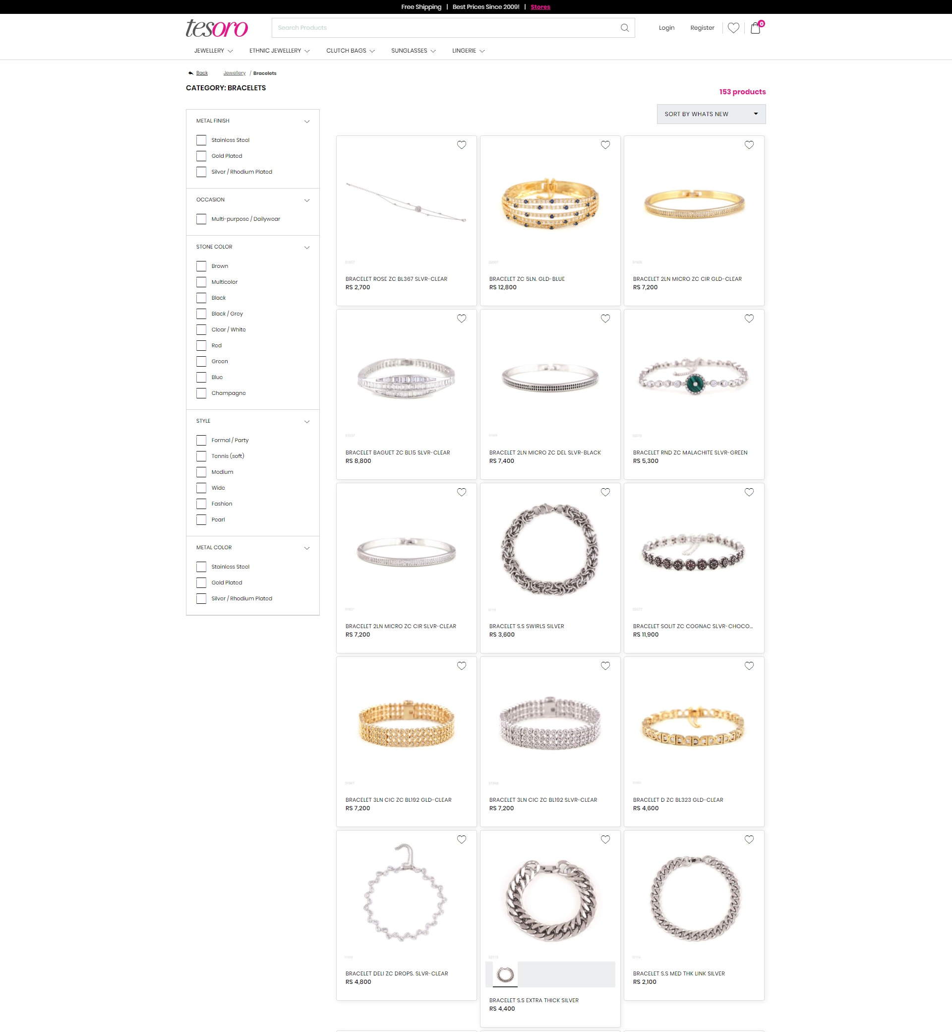
Products Listing Page
Next on the list is the product listing page, pretty simple, with a lot of filters on the left, a few filters on the top right, and finally an infinite scroll of products on the right middle.
Single Product Page
A good-looking product page is what every online store should have. Here is a simple minimal looking product page with images on the left and actions on the right, and on the bottom similar products component.

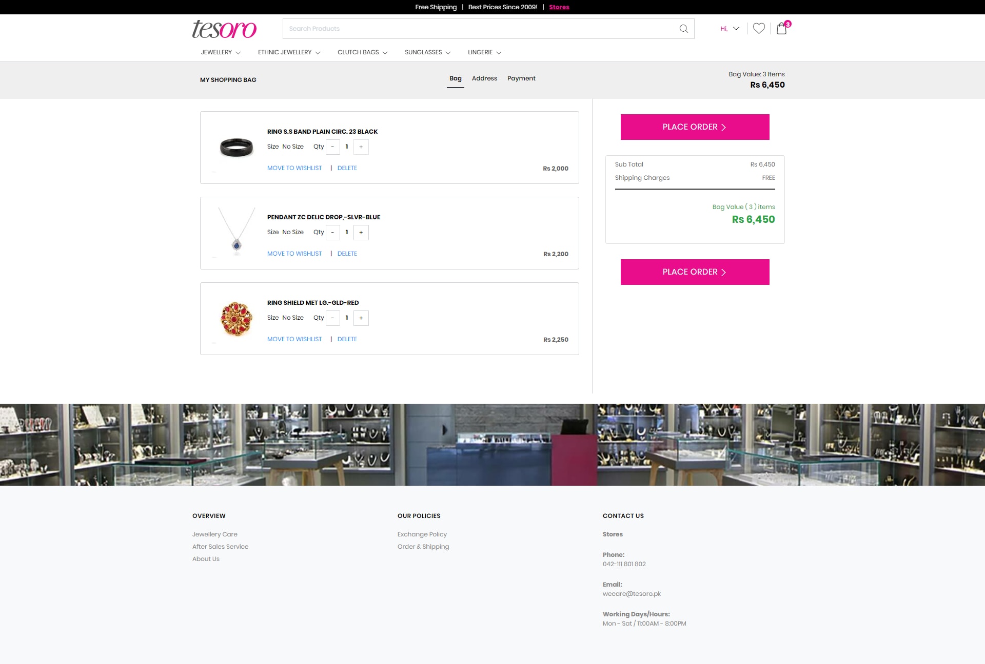
Checkout Page
Checkout consists of three steps, with the first page listing the customer’s selected products, the second screen for collecting their address information then finally payment information screen.
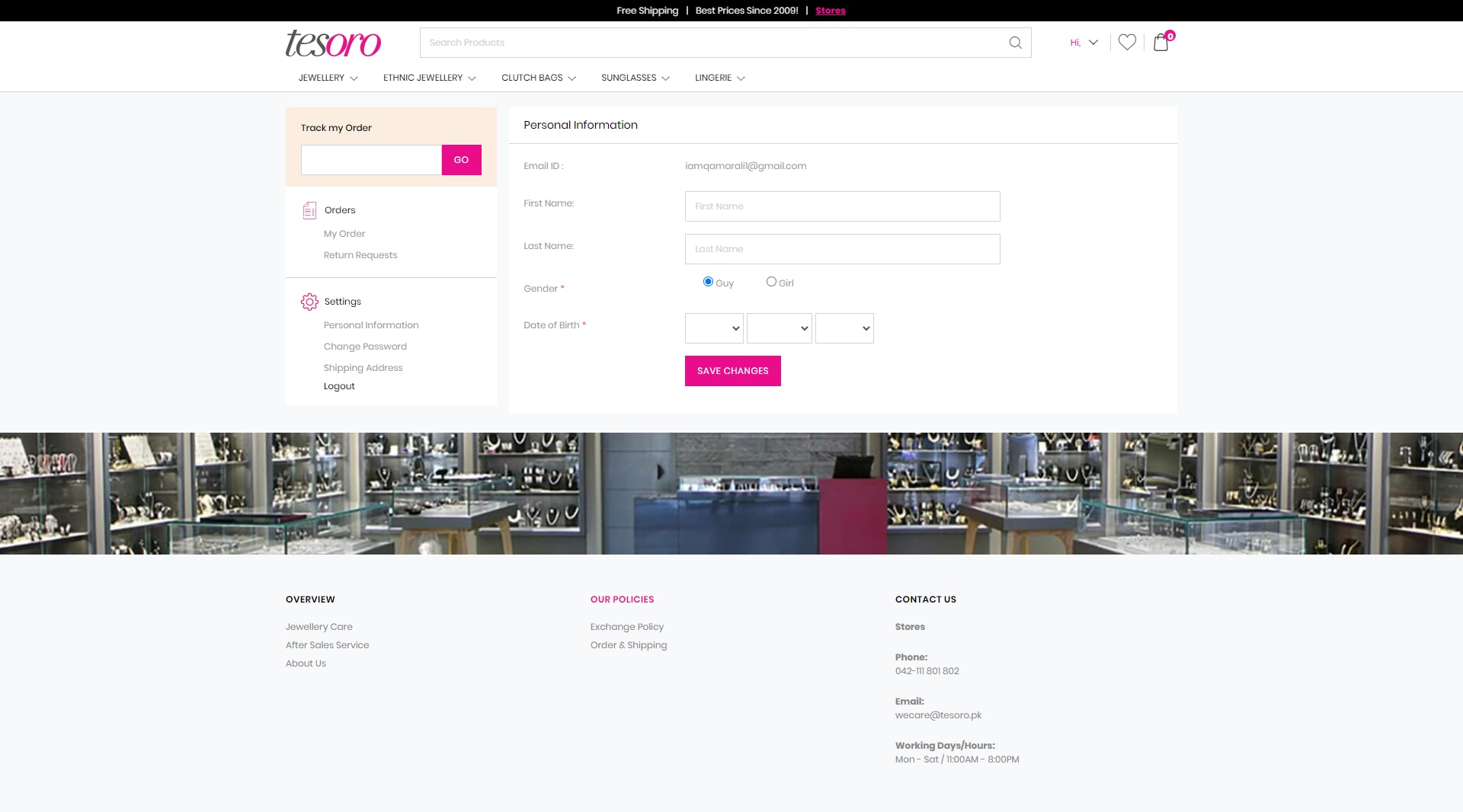
Customer Dashboard
Now your returning customers need a place to see their old purchases and track orders, so here’s a simple dashboard for customers to check their old orders, and save/change their payment information and account settings.
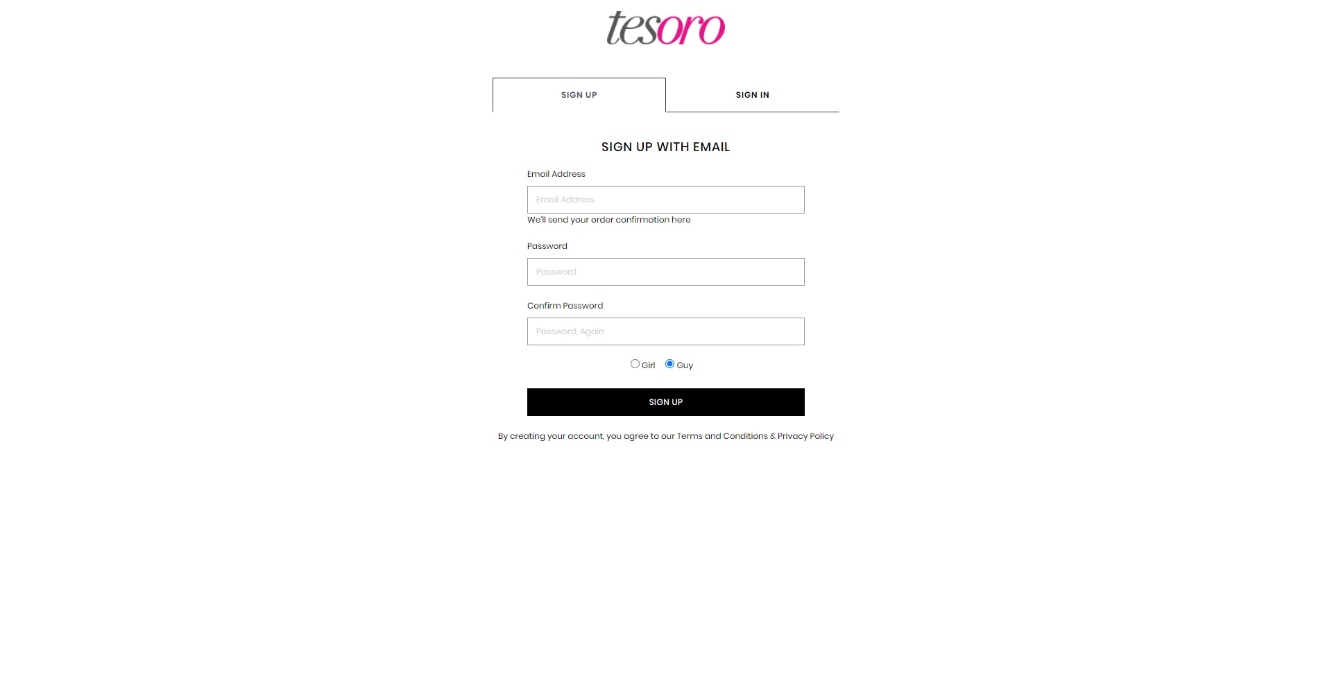
Login and Signup
Finally, there is much-needed login and signup page because how else will customers log in to their dashboard?
That’s all.!